All categories
Explorable Data
Problem
How can you help contributors see the current state of coverage or completeness of a dataset so that they can choose where to contribute?
Context
As specific tasks, contributors might be asked to focus on creating or improving individual records. But this low-level view of the dataset might not be the most natural way for them to understand the dataset as a whole. There may be other ways to present the data in order to encourage contributions.
Solution
Allow users to see and explore the dataset through one or more visualisations or alternate presentations of the data, that will help them explore the current contents and understand the current state of the database as a whole, rather than as a collection of individual records. Provide a means for contributors to edit data “in place” or easily navigate to an editing workflow from the visualisation.
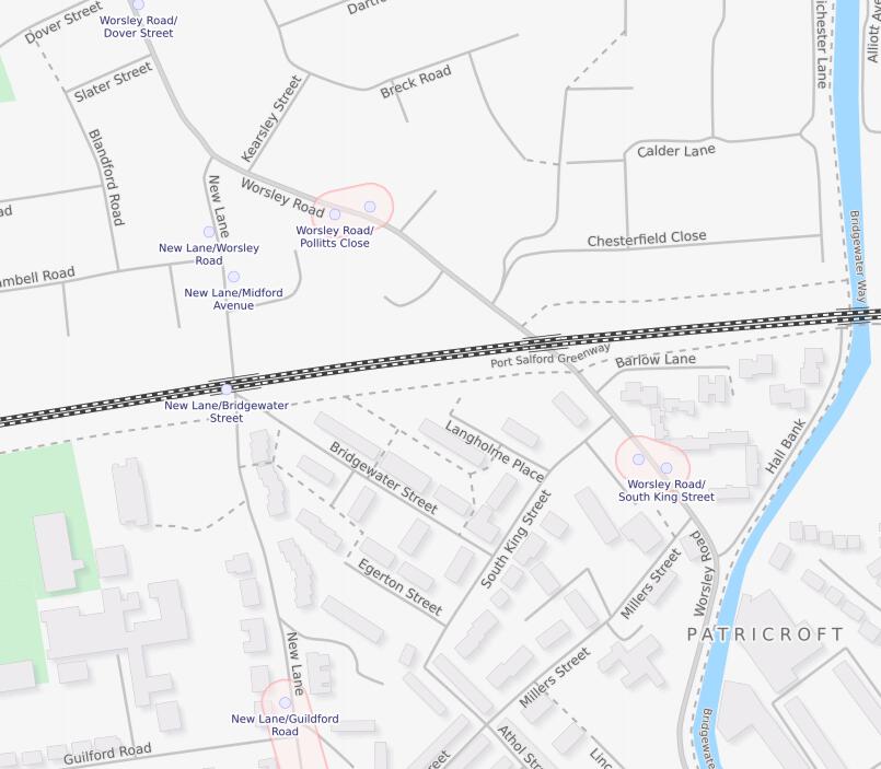
Depending on the type of data being collected there may be more than one way to present the data. For example data that is tied to geographical locations might be best presented as a map that will allow a user to intuitively understand the current coverage of the dataset and identify opportunities to contribute in their local area.
Other datasets might lend themselves to other types of visualisation, for example a project that is cataloguing historical data might present it as a time series which will help to highlight gaps in the record. Datasets that involve cataloguing or describing things might provide a means to visualise the use of categories across the dataset to identify areas that are under-represented.
Visualising the data as a whole has the advantage that it is easy to see where there are gaps and the user can start making useful contributions.
Allowing contributors to jump between exploring a dataset and contributing to improving it can help to create a more natural workflow.
Related patterns
Visibly Editable
It may not be clear to users that they can immediately fix a problem
Suggested Edits
Records in the dataset are incomplete but could be improved through some small additions.
Progress Indicator
Contributors need to see that the project is progressing.